Presentation
Advanced Top Menu is a module that allows you to create a fully-customisable menu in order to display some or all of the products from your catalog for your visitors. Thanks to its flexibility, you can also insert categories, manufacturers, CMS pages, custom links, images and products and even a search engine.
General Points and Operating Principles
A rich menu is a navigation bar that has 5 types of objects: – tabs, submenus, columns, groups of items and items. Tabs are associated with submenus that contain columns, which themselves contain groups of items, which, in turn, contain items.
Tabs are the first component that your visitors will see. They are always displayed and usually represent the main categories for the site. A content area, which is hidden by default, appears if you move the mouse over a tab. This is the submenu.
This submenu must contain at least one column that spans the full width of the submenu. You can add more columns. They will be distributed evenly over the available width of the submenu. You can use these columns to distribute and organise the many links that you are going to add to the submenu.
You can create two different types of links to organise and differentiate between the different links in the columns – groups of items and items These two types of links are very similar, with groups of items being able to gather together items in clusters, thus reflecting the tree structure of your catalog.
The module supports an unlimited number of tabs, columns, groups and items, allowing you to display and organise the information you want to display, without being restricted in any way.
One of the major advantages of Advanced Top Menu is that you can graphically customise each object in the mega menu. What is more, Advanced Top Menu is responsive design compatible. This means that it can adapt the way it is displayed to the size of the screen that your visitors are using.
The menu objects that are displayed can be linked to the status of your visitors.
And, finally, it can also use the Smarty Cache in PrestaShop in order to maintain the normal load time of the pages.
Installation
To install Advanced Top Menu, see our tutorial on how to install a module here
Maintenance Mode
This module has a maintenance mode. You can find the tutorial here
Configuration
Configuring the Menu
Add a Tab
General Settings
Type
This allows you to select the type of page for which you are creating the link.
Specific Selection List
A specific selection list appears once you have chosen the type, allowing you to select the page to which the tab should take the visitor when it is clicked.
This selection list shall be displayed for the following types: CMS, category, manufacturer and supplier. You may also choose to display all the pages of this type, using the option provided.
Link
You can create a tab with a custom destination address, which is not a page in your PrestaShop catalog. You should note that you can define a different URL for each language you have installed and activated in PrestaShop
Prevent click on link
This allows you to deactivate the link created for the menu buttons. More specifically, the destination address of the link will be replaced by the # character
Target
This allows you to choose the target for the link. This is set to No Target, by default, so that the page complies with the W3C recommendations
You can change this behaviour and choose to open your links in the following targets: _self, _blank, _top, _parent.
Don’t modify this parameter if you do not know what it does.
Title
This allows you to set a custom title for the tab. If this field is empty the menu button will display the title for the associated page.
You can set one title for each language that you have installed in PrestaShop.
Active
This allows you to display or hide this tab from your visitors.
Active on mobile
This allows you to display or hide this tab from your visitors that are using mobile devices.
Privacy options
This allows you to set the visibility of the tab. The visibility is public by default, meaning that anyone visiting the shop can see this tab.
If you choose Guests Only, only those visitors that do not have an account and/or those who have not logged in will see this tab
Conversely, Logged in Users Only, will allow only users that have an account and have logged in to see the tab.
Icon or image
This allows you to select an image to be linked to the tab. The following file formats are compatible: gif, png and jpg.
You can add one image for each language that has been installed for the shop
Warning: the images are not resized and will be displayed at their full size. So remember to resize them before you link them to the tab.
Image legend
This allows you to set the alternate text to be added. You can set one text for each language that has been installed on the shop.
Styles and Appearance
Text Color
This allows you to set the color of the title on the tab.
Text Color Over
This allows you to set the MouseOver color of the title on the tab.
Background Color
This allows you to set the color of the tab. Just click the field to display the color picker or enter a hex code for the color.
You can also create a two-color vertical linear gradient by ticking the corresponding checkbox, then choosing the second color.
Background Color Over
This allows you to set the Background Color on mouse over of the tab. Just click the field to display the color picker or enter a hex code for the color.
You can also create a two-color vertical linear gradient by ticking the corresponding checkbox, then choosing the second color.
Border size
This allows you to set the width of the border, in pixels, for each of the borders of the tab.
Border Color
This allows you to set the border color for the tab. Click to display a color picker or enter the hex code for the color.
Submenus Settings
Width (px)
This allows you to set the width of the submenu associated with the tab, in pixels. If this is left empty, the width of the submenu will be the same as the width of the menu bar.
Minimum Height (px)
This allows you to set a minimum height for the submenu, even if it has no content. If the content takes up more space than the value entered, the submenu automatically increases in height, so as to avoid any overflow. Leave this empty to slave the height of the submenu to its content.
Position
This allows you to set the position of the submenu that is associated with the tab. You may choose from four positions:
– Use the global styles: the submenu will use the settings defined in the General Settings for the module
– Left-align the submenus with the current tab: the submenu will be aligned with the left-hand side of the tab currently being edited
– Right-align the submenus with the current menu: the submenu will be aligned with the right-hand side of the tab currently being edited
– Align the submenus with the menu itself: the submenu will be aligned with the left-hand side of the navigation bar
Background Color
This allows you to set the background color of the submenu associated with the tab.
Border size
This allows you to set the border width for the submenu associated with the tab. You can set a value, in pixels, for each side.
Border Color
This allows you to set the border colour of the submenu being edited.
Show Additional Text
This allows you to create additional text areas that will be displayed in the submenu.
Columns are containers that are placed in the submenu. You can create these via the next tab.
Add Column
General Settings
Parent tab
This allows you to choose the tab to which the column will be added.
A column must be placed in a tab.
Title (not displayed in the front office)
This allows you to set an internal title for the column. This title will only be displayed in the back office.
Active
This allows you to display or hide this column from your visitors.
Active on mobile
This allows you to display or hide this column from your visitors that are using mobile devices.
Privacy options
This allows you to set the visibility of the tab. The visibility is public by default, meaning that anyone visiting the shop can see this tab.
If you choose Guests Only, only those visitors that do not have an account and/or those who have not logged in will see this tab
Conversely, Logged in Users Only, will allow only users that have an account and have logged in to see the tab.
Styles and Appearance
Width
This allows you to set the width of the column, in pixels. Leave this empty to slave the width of the column to its content.
Background Color
This allows you to set the background color for the column. Leave this empty to set it to transparent.
Text Color for Groups of Items
This allows you to set the text color for the groups in the column.
Groups of items (which you create, modify and delete under the next menu item) are containers for items that must be placed in a column to exist.
Text Color Over for Groups of Items
This allows you to set the Text Color Over for the groups of items in the column.
Groups of items (which you create, modify and delete under the next menu item) are containers for items that must be placed in a column to exist.
Text Color for Items
This allows you to set the text color for the items in the column.
These items must be placed in groups of items, but the color of the groups of items does not affect the color of the items.
Text Color Over for the Items
This allows you to set the Text Color Over for the items.
Show Additional Text
This allows you to display an additional two new sections of text in the column, one above it and one below it.
Add a Group of Items
General Settings
Parent tab
This allows you to choose the tab to which the group of items will be added.
Parent Column
This allows you to choose the column to which the group of items will be added.
Type
This allows you to select the type of page for which you are creating the link. Once you have chosen, a new option will appear below, allowing you to specify either a particular page, of the type you have just selected, or all pages of the selected type of content.
Specific Selection List
Depending on the type chosen in the previous step, a selection list appears, allowing you to choose the page that you want to link to.
This selection list shall be displayed for the following types: CMS, category, manufacturer and supplier. You may also choose to display all the pages of the same type.
Prevent click on link
This allows you to deactivate the link for the group of items. More specifically, the destination address of the link will be replaced by the # character
Target
This allows you to choose the target for the link. This is set to No Target, by default, so that the page complies with the W3C recommendations
You may also set the following targets: _self, _blank, _top, _parent.
Don’t modify this parameter if you do not know what it does.
Title
This allows you to set the title for the group of items. The original title of the link will be replaced with any text you enter here. Otherwise the original title for the link will be used.
You can set one title for each language that you have installed in PrestaShop.
Active
This allows you to display or hide this group of items from your visitors.
Active on mobile
This allows you to display or hide this group of items from your visitors that are using mobile devices.
Privacy options
This allows you to set the visibility for the group of items. The visibility is set to public by default, meaning that anyone visiting the shop can see this group of items .
If you choose Guests Only, only those visitors that do not have an account and/or those who have not logged in will see this group of items
Conversely, Logged in Users Only, will allow only users that have an account and have logged in to see the group.
Icon or image
This allows you to select an image to be linked with the group of items. The following file formats are compatible: gif, png and jpg.
You can add one image for each language that has been installed on the shop
Image legend
This allows you to set the alternate text to be added. You can set one text per language installed on the shop.
Show Additional Text
This allows you to create two additional text areas, which will be displayed in the groups of items in the submenu.
Groups of items are containers that are placed in columns. You can create as many of them as you like.
Add Item
General Settings
Parent tab
This allows you to choose the tab to which the item will be added.
Parent Group
This allows you to choose the group of items to which the item will be added.
An item must be placed in a group of items.
Type
This allows you to select the type of page for which you are creating the link. Once you have chosen, a new option will appear below, allowing you to specify either a particular page, of the type you have just selected, or all pages of the selected type of content.
Specific Selection List
A selection list, dependent on the type chosen in the previous step, appears, allowing you to choose the page that you want to link to.
This selection list shall be displayed for the following types: CMS, category, manufacturer and supplier. You may also choose to display all the pages of the same type.
Prevent click on link
This allows you to deactivate the link for the item. More specifically, the destination address of the link will be replaced by the # character.
Target
This allows you to choose the target for the link. This is set to No Target, by default, so that the page complies with the W3C recommendations
You may also set the following targets: _self, _blank, _top, _parent.
Don’t modify this parameter if you do not know what it does.
Title
This allows you to set the title for the menu button. The original title of the link will be replaced with any text you enter here. Otherwise the original title for the link will be used.
You can set one title for each language that you have installed in PrestaShop.
Active
This allows you to display or hide this item from your visitors.
Active on mobile
This allows you to display or hide this group of items from your visitors that are using mobile devices.
Privacy options
This allows you to set the visibility for the item. The visibility is set to public by default, meaning that anyone visiting the shop can see this item.
If you choose Guests Only, only those visitors that do not have an account and/or those who have not logged in will see this item.
Conversely, Logged in Users Only, will allow only users that have an account and have logged in to see the item.
Icon or image
This allows you to select an image to be linked with the item. The following file formats are compatible: gif, png and jpg.
You can add one image for each language that has been installed on the shop
Image legend
This allows you to set the alternate text to be added. You can set one text per language installed on the shop.
General Settings
General Settings
Menu Position
This allows you to choose the location of the menu on the page from the following hooks:
Activate Theme Compatibility Mode
This changes the structure of the menu bar slightly in order to optimise the way it is displayed when installed with other themes.
Activate or deactivate this option if the menu is not displaying correctly.
Activate Cache (faster processing)
This allows you to activate the Smarty cache for the menu. This maintains the usual load time for the pages.
Caching places the results of requests that have already been carried out to obtain the menu in the memory, so that the next time the menu is called the version placed in the memory is used, thus allowing it to be displayed faster.
Activate Autocompletion in Search Input
This allows you to activate autofill in the search box(es) in the menu.
Autofill is a feature that automatically suggests a term, based on the text the user has entered.
Menu Bar Container Settings
Inner spaces – padding (px)
This allows you to set the padding for the menu bar container. You can set a value for each side of the container.
Enter the value in pixels.
Outer spaces – margin (px)
This allows you to set the margin for the menu bar container. You can set a value for each side of the container.
Enter the value in pixels.
Border Color
This allows you to set the border color for the menu bar container.
Border size (px)
This allows you to set the border width for the menu bar container.
Position
This allows you to set the position of menu. There are three different positions:
– Relative (by default): this positions the menu relative to the other items in its container.
– Absolute: this positions the menu in the position specified, without taking the other items in the container into account.
– Sticky: this positions the menu relative to the other items in its container. If you scroll down the page, the menu will follow the movement, staying at the top of the window, so that it can always be accessed. If its original position is visible, it will return to that position.
Positioning (px)
This is particularly useful if the position of the menu bar is set to Absolute, since these settings will allow you to define the exact position of the menu bar relative to its reference point.
Menu Bar Settings
Highlight Current Menu Button (status:active)
This allows you to apply the MouseOver status to links with a destination address that is identical to the page that the visitor is viewing.
For example, if the menu has a Menswear category tab, and you are on the menswear category page, the tab will look like it does on MouseOver (it will use the colors defined when it was created).
Width (px)
This allows you to set the width of the menu bar, in pixels. Leave this empty to have the menu bar fill the entire width of its container.
Height (px)
This allows you to set the height of the menu bar, in pixels. Leave this empty to slave the height of the menu bar to its content.
Inner spaces – padding (px)
This allows you to set the spacing between the border and the content of the menu bar. You can set the value for each side of the menu bar.
Outer spaces – margin (px)
This allows you to set the spacing between the outer edge and the menu bar. You can set the value for each side of the menu bar.
Z-index value (CSS)
This allows you to set the depth of the menu. You can use this to deal with problems caused by items overlapping each other.
Some blocks in the shop may be associated with a layer. These layers may overlap. The overlap order is defined by the z-index. Items with higher z-index values are shown on the top and will overlap those with a lower z-index value.
Background Color
This allows you to set a background color for the menu bar. Enter a hex code for a solid color or create a two-color gradient by ticking the box indicated and filling in both fields.
Border Color
This allows you to set the border color for the menu bar.
Border size (px)
This allows you to set the border width for the menu bar, in pixels.
Drop Shadow
This allows you to set a drop shadow for the menu bar. You can set the horizontal and vertical axes, blur and offset for the shadow.
Drop Shadow Color
This allows you to set the color of the shadow for the menu bar.
Drop Shadow Opacity
This allows you to set the opacity of the shadow for the menu bar.
Tabs Settings
Inner spaces – padding (px)
This allows you to set the spacing between the border and the content of the tab. You can set a value, in pixels, for each side of the tab.
Outer spaces – margin (px)
This allows you to set the spacing between the outer edge and the tab. You can set a value, in pixels, for each side of the tab.
Text Size (px)
This allows you to set the text size for the tabs.
Text in Bold
This allows you to use bold text on the tabs.
Underline Text
This allows you to use underlined text on the tabs.
Underline Text (on mouse over)
This allows you to have underlined text on the tabs on mouseover.
Text Transformation
This allows you to transform the text for the tabs in 4 different ways:
– Normal (inherit): the text retains its initial formatting.
– lowercase: all the text on the tabs will be in lowercase.
– UPPERCASE: all the text on the tabs will be in uppercase .
– Initial Capitals: Each word on the tab will start with a capital letter, with the rest of the word being in lowercase.
Text Font
This allows you to change the font for the text on the tabs. Your theme font is used by default.
You may, however, choose a different font for the tabs, from the options given.
Text Color
This allows you to set the text color for the tabs.
Text color (on mouse over)
This allows you to set the Text Color Over for the tabs.
Background Color
This allows you to set the background color for the tabs. You can also create a two-color gradient by ticking the gradient checkbox, then choosing the two colors.
Background Color (on mouse over)
This allows you to set the background color for the tabs on mouse over.
You can also create a two-color gradient by ticking the gradient checkbox, then choosing the two colors.
Border Color
This allows you to set the color of the border of the tabs. Click to display a color picker or enter the hex code for the color.
Border size (px)
This allows you to make the each side of the borders for the tabs thicker or thinner.
Submenu Settings
The submenus are the banners that appear when you move the mouse over a tab and contain columns, groups and items.
Width (px)
This allows you to set the width of the submenus, in pixels.
Minimum Height (px)
This allows you to set the minimum height of the submenus, in pixels.
Z-index value (CSS)
This allows you to set the depth for the submenu. You can use this to deal with problems caused by items overlapping each other.
Some blocks in the shop may be associated with a layer. These layers may overlap. The overlap order is defined by the z-index. Items with higher z-index values are shown on the top and will overlap those with a lower z-index value.
Opening method
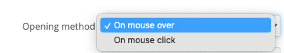
This option allows you to choose the way submenus are opened: either when you hover over them (choose “On mouse over”), or when you click on them (choose “On mouse click”).
Position
This allows you to set the position of the submenus. There are two pre-defined positions:
– Align the submenus with the main menu: this position aligns the submenus with the left-hand side of the menu bar. The width occupied by the submenus will therefore be the same as the width of the menu, thus making it look like a mega menu.
– Left-align the submenus with the current menu: this position aligns the submenus with the left-hand side of the parent item. The width occupied by the submenus will therefore be dependent on its content, thus making it look like a drop-down menu.
Background Color
This allows you to set the background color of the submenus. You may also set a two-color gradient by ticking the gradient checkbox and selecting the start color and the end color.
Border Color
This allows you to set the border color for the submenus. Click this area to display a color picker or enter the hex code for the color.
Border size (px)
This allows you to make the borders for the submenus thicker or thinner.
Drop Shadow
This allows you to create a drop shadow for the submenus. You can set the horizontal and vertical axes, blur and offset for the shadow.
Drop Shadow Color
This allows you to set the color of the shadow.
Drop Shadow Opacity
This allows you to set the opacity of the shadow. Move the cursor to change the opacity.
Opening Delay
This allows you to set the time in seconds that the system needs to wait before displaying the submenu, once the cursor has been positioned on a tab.
Fade Effect Duration
This allows you to set the opening fade time for the submenus in seconds.
Column Settings
Inner spaces – padding (px)
This allows you to set the spacing between the border and the content for the columns.
You can set a value, in pixels, for each side of the menu bar.
Settings for Groups of Items
Container Settings
Inner spaces – padding (px)
This allows you to set the spacing between the borders and the content of the containers that hold the groups of items.
You can set a different value for each side of the container.
Outer spaces – margin (px)
This allows you to set the spacing between external objects and the borders of the containers that hold the groups of items..
You can set a different value for each side of the container.
Heading Settings
Inner spaces – padding (px)
This allows you to set the spacing between the borders and the heading.
You can set a different value for each side of the heading.
Outer spaces – margin (px)
This allows you to set the spacing between the heading container and the other items.
You can set a different value for each side of the heading.
Text Size (px)
This allows you to set the text size for the title, in pixels.
Text in Bold
This allows you to use bold text for the headings for the groups of items.
Underline Text
This allows you to use underlined text for the headings for the groups of items.
Underline Text (on mouse over)
This allows you to use underlined text for the headings for the groups of items on MouseOver.
Text Transformation
This allows you to transform the text for the tabs in 4 different ways:
– Normal (inherit): the text retains its initial formatting.
– lowercase: all the text on the tabs will be in lowercase.
– UPPERCASE: all the text on the tabs will be in uppercase .
– Initial Capitals: Each word on the tabs will start with a capital letter, with the rest of the word being in lowercase.
Text Font
This allows you to change the font for the headings for the groups of items. Your theme font is used by default.
You may, however, choose a different font for the tabs, from the options given.
Heading Text Color
This allows you to set the text color for the group headings.
Heading Text Color (on mouse over)
This allows you to set the Text Color Over for the headings for the groups of items
Item Settings
Inner spaces – padding (px)
This allows you to set the spacing between the border and the content of the items. You can set a value for each side of the container.
Outer spaces – margin (px)
This allows you to set the spacing between the border of the container for your items and the other objects.
Text Size (px)
This allows you to set the text size for the items, in pixels.
Text in Bold
This allows you to use bold text for the items.
Underline Text
This allows you to use underlined text for the items.
Underline Text on Mouseover
This allows you to use underlined MouseOver text for the items.
Text Transformation
This allows you to transform the text for the items in 4 different ways:
– Normal (inherit): the text retains its initial formatting.
– lowercase: all the text for the items will be in lowercase.
– UPPERCASE: all the text for the items will be in uppercase .
– Initial Capitals: Each word for the item will start with a capital letter, with the rest of the word being in lowercase.
Text Font
This allows you to change the text font for the items. Your theme font is used by default.
You may, however, select a different font for the tabs from among the options given.
Text Color
This allows you to set the text color for the items. Enter a hex code for the color in the box.
Text Color on MouseOver
This allows you to set the Text Color Over for the items. Enter a hex code for the color in the box.
Mobile Settings
Responsive Design Settings
Activate Responsive Mode
This allows you to activate Responsive Design for the menu. Check that the theme is Responsive Design compatible.
Responsive design is an alternative version of the menu that makes it compatible with mobile devices with smaller screens, such as smartphones.
Activate Mobile Mode up to (px)
This allows you to set the threshold under which mobile mode shall be activated for customers. If the customers use devices that are larger than this threshold, they will see the standard menu. Otherwise the responsive menu will be displayed
Settings for the Menu Toggle Button
Height (px)
This allows you to set the height of the tab that allows the menu to be opened.
Text Size (px)
This allows you to set the height of the text on the tab that allows the menu to be opened.
Text
This allows you to set the text for the tab that allows the menu to be opened. You can set one text for each language that has been installed on the shop.
If you do not set a text, the term “MENU” will appear on this tab.
Background Color (Opened state)
This allows you to set the background color for the menu toggle tab, used when the menu is open.
Background Color (Closed state)
This allows you to set the background color for the menu toggle tab, used when the menu is closed.
Text Color (Opened state)
This allows you to set the text color for the menu toggle tab, used when the menu is open.
Text Color (Closed state)
This allows you to set the text color for the menu toggle tab, used when the menu is closed.
Icon
This allows you to set the icon to be displayed next to the text for the menu toggle tab.
This means you can import an image from your hard disk.
Tick the Delete Current Image checkbox if you want to return to the default image.
Tab Settings
Inner spaces – padding (px)
This allows you to set the spacing between the border and the content of the tab. You can set a value, in pixels, for each side of the tab.
Enter the value in pixels
Outer spaces – margin (px)
This allows you to set the spacing between external objects and the tab. You can set a value, in pixels, for each side of the tab.
Enter the value in pixels
Text Size (px)
This allows you to set the text size for the items, in pixels.
Text in Bold
This allows you to use bold text for the items.
Text Transformation
This allows you to transform the text for the tabs in 4 different ways:
– Normal (inherit): the text retains its initial formatting.
– lowercase: all the text on the tabs will be in lowercase.
– UPPERCASE: all the text on the tabs will be in uppercase.
– Initial Capitals: Each word on the tab will start with a capital letter, with the rest of the word being in lowercase.
Text Font
This allows you to change the font for the text on the tabs. Your theme font is used by default.
You may, however, choose a different font for the tabs, from the options given.
Background Color (Opened state)
This allows you to set the background color for an open tab.
Background Color (Closed state)
This allows you to set the background color for closed tabs.
Text Color
This allows you to set the text color for the tabs.
Border Color
This allows you to set the border color for the menu items.
Border size (px)
This allows you to set the border width for the menu items, in pixels. You can set a different value, in pixels, for each side of the menu items.
Submenu Settings
Background Color
This allows you to set the background color for the submenus, by entering a hex code for the color or clicking the box to display the color picker. You may also set a two-color gradient by ticking the associated checkbox and selecting a start color and an end color in the two boxes.
Border Color
This allows you to set the background color for the submenus, by entering a hex code for the color or clicking the box to display the color picker.
Border size (px)
This allows you to set the border width for the submenus, in pixels. You can set a different value, in pixels, for each side of the submenus.
Icon for opened state
This allows you to set the icon for the submenus when they are open.
Icon for closed state
This allows you to set the icon for the submenus when they are closed.
Column Settings
Inner spaces – padding (px)
This allows you to set the spacing between the borders and the content of the columns.
You can set a value, in pixels, for each side of the menu bar.
Outer spaces – margin (px)
This allows you to set the spacing between the borders of the columns and external objects.
You can set a value, in pixels, for each side of the menu bar.
Border Color
This allows you to set the border color for the columns. You can set a hex color or click the box to show a color picker.
Border size (px)
This allows you to set the border width for the columns.
Settings for Groups of Items
Container Settings
Inner spaces – padding (px)
This allows you to set the spacing between the borders and the content of the containers that hold the groups of items.
You can set a different value for each side of the container.
Outer spaces – margin (px)
This allows you to set the spacing between external objects and the containers that hold the groups of items.
You can set a different value for each side of the container.
Heading Settings
Inner spaces – padding (px)
This allows you to set the spacing between the borders and the heading.
You can set a different value for each side of the heading.
Outer spaces – margin (px)
This allows you to set the spacing between the heading container and the other items.
You can set a different value for each side of the heading.
Text Size (px)
This allows you to set the text size for the heading, in pixels.
Text Transformation
This allows you to transform the text for the headings for the groups of items in 4 different ways:
– Normal (inherit): the text retains its initial formatting.
– lowercase: the headings for the groups of items will be entirely in lowercase.
– UPPERCASE: the heading for the groups of items will be entirely in uppercase.
– Initial Capitals: Each word will start with a capital letter, with the rest of the word being in lowercase.
Text in Bold
This allows you to use bold text for the headings for the groups of items.
Text Font
This allows you to set the text font for the headings for the groups of items. Your theme font is used by default.
Text Color
This allows you to set the text color for the headings for the groups of items.
Item Settings
Inner spaces – padding (px)
This allows you to set the spacing between the borders and the items.
You can set a different value for each side of the items.
Outer spaces – margin (px)
This allows you to set the spacing between external objects and the items.
You can set a different value for each side of the items.
Text Size (px)
This allows you to set the text size for the items, in pixels.
Text in Bold
This allows you to use bold text for the items.
Text Transformation
This allows you to transform the text for the items in 4 different ways:
– Normal (inherit): the text retains its initial formatting.
– lowercase: all the text for the items will be in lowercase.
– UPPERCASE: all the text for the items will be in uppercase .
– Initial Capitals: Each word will start with a capital letter, with the rest of the word being in lowercase.
Text Font
This allows you to set the font for the items. Your theme font is used by default.
Text Color
This allows you to set the text color for the items. Enter the hex color or click to show the color picker.
Advanced Styles
CSS Class Settings
Menu Container (#adtm_menu)
This allows you to add additional classes to the adtm_menu object which is the container for the menu.
If the menu displays correctly, you can leave this field empty. It is for graphic integrators who want to apply specific CSS styles to the element.
Menu Subcontainer (#adtm_menu_inner)
This allows you to add additional classes to the adtm_menu_inner object which is the direct child of adtm_menu.
If the menu displays correctly, you can leave this field empty. It is for graphic integrators who want to apply specific CSS styles to the element.
Advanced Styles (advanced users)

This allows you to insert CSS code to customise the menu in more depth, or add an integration that is entirely in CSS.