Presentation
Modal Cart is a module that allows you to set a confirmation window to appear when a product is added to the cart. This means that your customer sees a visual effect that shows them that the product has been added and may use the buttons provided to continue shopping or go to their cart.
General Points and Operating Principles
A modal window is a window that takes control of the foreground of the page in order to display and offer your customer one or several actions. This module provides 3 types of modal windows: cart summary, last product added or notification. Each of its types has advanced customisation tools that allow you to use text, images and content. Modal Cart is, furthermore, able to manage the product attributes, the shipping costs for your customer’s cart and the taxes for the products chosen.
You can increase the average cart total for your customer by combining this module with Cross Selling on Cart, so as to integrate cross selling into your modal windows.
Installation
To install Modal Cart, see our tutorial on how to install a module here
Activate Maintenance Mode
This module has a maintenance mode. You can find the tutorial here
Configuration
Type of window
This allows you to set the type of modal window to be displayed when a product is added to the cart. Each window offers you different behaviour and customisation options, as follows:
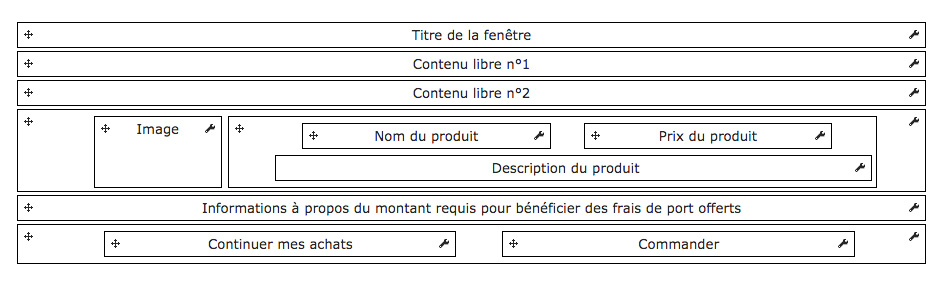
Cart Summary
This type of window allows you to show the list of products that are in the cart when a product is added to the cart. You can, furthermore, give other information, such as the tax total or information on the shipping costs.
Configuration
Show Title
This allows you to show a title for the modal windows. This title can be configured in the graphical representation.
Show Free Content 1
This allows you to show a free content zone. You can set a background color and the borders for this zone and there is a text area that you can use to enter variables, such as the number of products or the cart total.
Show Free Content 2
This allows you to show a second free content zone. You can set a background color and the borders for this zone and there is a text area that you can use to enter variables, such as the number of products or the cart total.
Show Fields (from the table)
This allows you to show the fields from columns in the cart summary, i.e. image, product, availability, price, quantity, etc.
Show the Required Total to be Eligible for Free Shipping
This allows you to show how much more the customer needs to spend before they are eligible for free shipping.
Show Subtotal
This allows you to show a subtotal in the cart summary.
Show Taxes
This allows you to show the total tax under the cart summary table.
Show Discounts
This allows you to show the discounts under the cart summary table.
Show Shipping
This allows you to show the shipping costs under the cart summary table.
If you activate this option the shipping costs for your default carrier will be given if your customer has not yet entered their delivery address. The shipping costs for the order may vary depending on the carrier your customer chooses.
Configure Cross Selling On Cart
This allows you to show cross-selling suggestions in the cart summary window.
You must have purchased our Cross Selling on Cart module and it must be installed and activated
Add to Cart Button Selector (general)
This allows you to set the CSS selector that allows the add to cart button to be highlighted on pages other than a product sheet, such as category pages, for example.
Add to Cart Button Selector (product sheet)
This allows you to set the CSS selector that allows the add to cart button to be recognized on a product sheet.
Graphical Representation
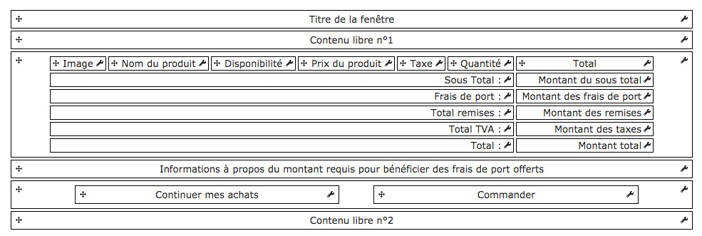
This diagram represents the structure of the modal window. This is where you can configure each active item, along with their position, by clicking and dragging the item to the required position, with the mouse on the arrow when you click and drag.
Window Title
Background Color
This allows you to set a background color for the block being edited, by entering hex color code or clicking the box to display the color picker. You can also create a gradient by ticking the gradient checkbox, then entering the second color.
Margin
This allows you to set the horizontal and vertical margins for the container for the block being edited.
The blue arrow allows you to apply the value from the first cell to all the others
Padding
This allows you to set the spacing between the content and the container for the block being edited.
The blue arrow allows you to apply the value from the first cell to all the others
Border
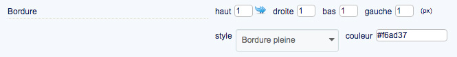
This allows you to create a border for the block that contains the item being edited. This is defined in pixels.
The blue arrow allows you to apply the value from the first cell to all the others
Corner Radius
This allows you to set the corner radius for the block that contains the item being edited. The higher the value, the rounder the corners, And conversely, the lower the value, the sharper the corners.
Drop Shadow
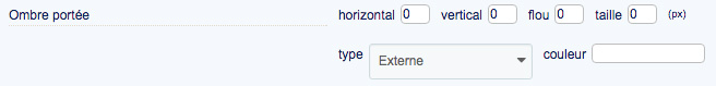
This allows you to set the drop shadow for the block that contains the item being edited. You can set it vertically or horizontally, inside or outside the header container and set its color, blur and offset.
Horizontal Alignment
This allows you to set the horizontal alignment for the container for the item being edited.
Content Options
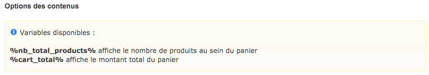
This block contains the options that allow you to configure the content for the item being edited. You are given variables that allow you to retrieve the context-based information from your customer’s cart.
You can include these variables directly in your text.
Text
This allows you to define the title for the item being edited
You can set one text for each language that has been installed on the shop.
Font Color
This allows you to set the text color of the item being edited.
Font Size
This allows you to set the size of the text in the block being edited.
Style
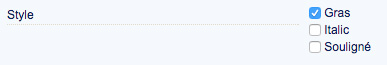
These options allow you to apply a text style to your title, i.e. bold, italic or underline.
Text Drop Shadow
This allows you to apply a shadow to the text in the block being edited.
Free Content 1
Background Color
This allows you to set a background color for the block being edited, by entering hex color code or clicking the box to display the color picker. You can also create a gradient by ticking the gradient checkbox, then entering the second color.
Margin
This allows you to set the horizontal and vertical margins for the container for the block being edited.
The blue arrow allows you to apply the value from the first cell to all the others
Padding
This allows you to set the spacing between the content and the container for the block being edited.
The blue arrow allows you to apply the value from the first cell to all the others
Border
This allows you to create a border for the block that contains the item being edited. This is defined in pixels.
The blue arrow allows you to apply the value from the first cell to all the others
Corner Radius
This allows you to set the corner radius for the block that contains the item being edited. The higher the value, the rounder the corners, And conversely, the lower the value, the sharper the corners.
Drop Shadow
This allows you to set the drop shadow for the block that contains the item being edited. You can set it vertically or horizontally, inside or outside the header container and set its color, blur and offset.
Content Options
This block contains the options that allow you to configure the content for the item being edited. You are given variables that allow you to retrieve the context-based information from your customer’s cart.
You can include these variables directly in your text.
Content to be Displayed
This allows you to enter the text to be displayed for the item being edited.
You can include content variables.
Image
Show
This allows you to show or hide the block being edited.
The block will appear in red on the graphical representation if hidden
Background Color
This allows you to set a background color for the block being edited, by entering hex color code or clicking the box to display the color picker. You can also create a gradient by ticking the gradient checkbox, then entering the second color.
Width
This allows you to set a width, in pixels, for the block being edited.
Padding
This allows you to set the spacing between the content and the container for the block being edited.
The blue arrow allows you to apply the value from the first cell to all the others
Border
This allows you to create a border for the block that contains the item being edited. This is defined in pixels.
The blue arrow allows you to apply the value from the first cell to all the others
Horizontal Alignment
This allows you to set the horizontal alignment for the container for the item being edited.
Vertical Alignment
This allows you to set the vertical alignment for the container for the item being edited.
Image Size
This allows you to set the size of the product images.
Add Product Sheet Link
This allows you to automatically add a hyperlink to the product image on the product sheet.
Border
This allows you to create a border for the block that contains the item being edited. This is defined in pixels.
The blue arrow allows you to apply the value from the first cell to all the others
Corner Radius
This allows you to set the corner radius for the block that contains the item being edited. The higher the value, the rounder the corners, And conversely, the lower the value, the sharper the corners.
Drop Shadow
This allows you to set the drop shadow for the block that contains the item being edited. You can set it vertically or horizontally, inside or outside the header container and set its color, blur and offset.
Product Name
Show
This allows you to show or hide the block being edited.
The block will appear in red on the graphical representation if hidden
Background Color
This allows you to set a background color for the block being edited, by entering hex color code or clicking the box to display the color picker. You can also create a gradient by ticking the gradient checkbox, then entering the second color.
Width
This allows you to set a width, in pixels, for the block being edited.
Padding
This allows you to set the spacing between the content and the container for the block being edited.
The blue arrow allows you to apply the value from the first cell to all the others
Border
This allows you to create a border for the block that contains the item being edited. This is defined in pixels.
The blue arrow allows you to apply the value from the first cell to all the others
Horizontal Alignment
This allows you to set the horizontal alignment for the container for the item being edited.
Vertical Alignment
This allows you to set the vertical alignment for the container for the item being edited.
Add Product Sheet Link
This allows you to automatically add a hyperlink to the product image on the product sheet.
Font Color
This allows you to set the text color of the item being edited.
Font Size
This allows you to set the size of the text in the block being edited.
Style
These options allow you to apply a text style to your title, i.e. bold, italic or underline.
Text Drop Shadow
This allows you to apply a shadow to the text in the block being edited.
Display Product Attributes
This allows you to show the corresponding attributes as Attributes for each product in the cart, as “Attribute : value”.
Font Color
This allows you to set the text color of the item being edited.
Font Size
This allows you to set the size of the text in the block being edited.
Style
These options allow you to apply a text style to your title, i.e. bold, italic or underline.
Availability
Show
This allows you to show or hide the block being edited.
The block will appear in red on the graphical representation if hidden
Background Color
This allows you to set a background color for the block being edited, by entering hex color code or clicking the box to display the color picker. You can also create a gradient by ticking the gradient checkbox, then entering the second color.
Width
This allows you to set a width, in pixels, for the block being edited.
Padding
This allows you to set the spacing between the content and the container for the block being edited.
The blue arrow allows you to apply the value from the first cell to all the others
Border
This allows you to create a border for the block that contains the item being edited. This is defined in pixels.
The blue arrow allows you to apply the value from the first cell to all the others
Horizontal Alignment
This allows you to set the horizontal alignment for the container for the item being edited.
Font Color
This allows you to set the text color of the item being edited.
Font Size
This allows you to set the size of the text in the block being edited.
Style
These options allow you to apply a text style to your title, i.e. bold, italic or underline.
Text Drop Shadow
This allows you to apply a shadow to the text in the block being edited.
Product Price
Show
This allows you to show or hide the block being edited.
The block will appear in red on the graphical representation if hidden
Width
This allows you to set a width, in pixels, for the block being edited.
Padding
This allows you to set the spacing between the content and the container for the block being edited.
The blue arrow allows you to apply the value from the first cell to all the others
Border
This allows you to create a border for the block that contains the item being edited. This is defined in pixels.
The blue arrow allows you to apply the value from the first cell to all the others
Horizontal Alignment
This allows you to set the horizontal alignment for the container for the item being edited.
Vertical Alignment
This allows you to set the vertical alignment for the container for the item being edited.
Font Color
This allows you to set the text color of the item being edited.
Font Size
This allows you to set the size of the text in the block being edited.
Style
These options allow you to apply a text style to your title, i.e. bold, italic or underline.
Text Drop Shadow
This allows you to apply a shadow to the text in the block being edited.
Tax
Show
This allows you to show or hide the block being edited.
The block will appear in red on the graphical representation if hidden
Width
This allows you to set a width, in pixels, for the block being edited.
Padding
This allows you to set the spacing between the content and the container for the block being edited.
The blue arrow allows you to apply the value from the first cell to all the others
Border
This allows you to create a border for the block that contains the item being edited. This is defined in pixels.
The blue arrow allows you to apply the value from the first cell to all the others
Horizontal Alignment
This allows you to set the horizontal alignment for the container for the item being edited.
Vertical Alignment
This allows you to set the vertical alignment for the container for the item being edited.
Font Color
This allows you to set the text color of the item being edited.
Font Size
This allows you to set the size of the text in the block being edited.
Style
These options allow you to apply a text style to your title, i.e. bold, italic or underline.
Text Drop Shadow
This allows you to apply a shadow to the text in the block being edited.
Quantity
Show
This allows you to show or hide the block being edited.
The block will appear in red on the graphical representation if hidden
Background Color
This allows you to set a background color for the block being edited, by entering hex color code or clicking the box to display the color picker. You can also create a gradient by ticking the gradient checkbox, then entering the second color.
Width
This allows you to set a width, in pixels, for the block being edited.
Padding
This allows you to set the spacing between the content and the container for the block being edited.
The blue arrow allows you to apply the value from the first cell to all the others
Border
This allows you to create a border for the block that contains the item being edited. This is defined in pixels.
The blue arrow allows you to apply the value from the first cell to all the others
Horizontal Alignment
This allows you to set the horizontal alignment for the container for the item being edited.
Vertical Alignment
This allows you to set the vertical alignment for the container for the item being edited.
Allow Quantity Updating
This allows you to display buttons that allow your customers to modify the quantities for each product (add, remove and delete buttons).
Font Color
This allows you to set the text color of the item being edited.
Font Size
This allows you to set the size of the text in the block being edited.
Style
These options allow you to apply a text style to your title, i.e. bold, italic or underline.
Text Drop Shadow
This allows you to apply a shadow to the text in the block being edited.
Total
Show
This allows you to show or hide the block being edited.
The block will appear in red on the graphical representation if hidden
Background Color
This allows you to set a background color for the block being edited, by entering hex color code or clicking the box to display the color picker. You can also create a gradient by ticking the gradient checkbox, then entering the second color.
Width
This allows you to set a width, in pixels, for the block being edited.
Padding
This allows you to set the spacing between the content and the container for the block being edited.
The blue arrow allows you to apply the value from the first cell to all the others
Border
This allows you to create a border for the block that contains the item being edited. This is defined in pixels.
The blue arrow allows you to apply the value from the first cell to all the others
Horizontal Alignment
This allows you to set the horizontal alignment for the container for the item being edited.
Vertical Alignment
This allows you to set the vertical alignment for the container for the item being edited.
Font Color
This allows you to set the text color of the item being edited.
Font Size
This allows you to set the size of the text in the block being edited.
Style
These options allow you to apply a text style to your title, i.e. bold, italic or underline.
Text Drop Shadow
This allows you to apply a shadow to the text in the block being edited.
Subtotal
Background Color
This allows you to set a background color for the block being edited, by entering hex color code or clicking the box to display the color picker. You can also create a gradient by ticking the gradient checkbox, then entering the second color.
Width
This allows you to set a width, in pixels, for the block being edited.
Padding
This allows you to set the spacing between the content and the container for the block being edited.
The blue arrow allows you to apply the value from the first cell to all the others
Border
This allows you to create a border for the block that contains the item being edited. This is defined in pixels.
The blue arrow allows you to apply the value from the first cell to all the others
Horizontal Alignment
This allows you to set the horizontal alignment for the container for the item being edited.
Vertical Alignment
This allows you to set the vertical alignment for the container for the item being edited.
Text
This allows you to define the title for the item being edited
You can set one text for each language that has been installed on the shop.
Font Color
This allows you to set the text color of the item being edited.
Font Size
This allows you to set the size of the text in the block being edited.
Style
These options allow you to apply a text style to your title, i.e. bold, italic or underline.
Text Drop Shadow
This allows you to apply a shadow to the text in the block being edited.
Subtotal amount
Background Color
This allows you to set a background color for the block being edited, by entering hex color code or clicking the box to display the color picker. You can also create a gradient by ticking the gradient checkbox, then entering the second color.
Width
This allows you to set a width, in pixels, for the block being edited.
Padding
This allows you to set the spacing between the content and the container for the block being edited.
The blue arrow allows you to apply the value from the first cell to all the others
Border
This allows you to create a border for the block that contains the item being edited. This is defined in pixels.
The blue arrow allows you to apply the value from the first cell to all the others
Horizontal Alignment
This allows you to set the horizontal alignment for the container for the item being edited.
Vertical Alignment
This allows you to set the vertical alignment for the container for the item being edited.
Display excl. tax
Font Color
This allows you to set the text color of the item being edited.
Font Size
This allows you to set the size of the text in the block being edited.
Style
These options allow you to apply a text style to your title, i.e. bold, italic or underline.
Text Drop Shadow
This allows you to apply a shadow to the text in the block being edited.
Shipping
Background Color
This allows you to set a background color for the block being edited, by entering hex color code or clicking the box to display the color picker. You can also create a gradient by ticking the gradient checkbox, then entering the second color.
Width
This allows you to set a width, in pixels, for the block being edited.
Padding
This allows you to set the spacing between the content and the container for the block being edited.
The blue arrow allows you to apply the value from the first cell to all the others
Border
This allows you to create a border for the block that contains the item being edited. This is defined in pixels.
The blue arrow allows you to apply the value from the first cell to all the others
Horizontal Alignment
This allows you to set the horizontal alignment for the container for the item being edited.
Vertical Alignment
This allows you to set the vertical alignment for the container for the item being edited.
Text
This allows you to define the title for the item being edited
You can set one text for each language that has been installed on the shop.
Font Color
This allows you to set the text color of the item being edited.
Font Size
This allows you to set the size of the text in the block being edited.
Style
These options allow you to apply a text style to your title, i.e. bold, italic or underline.
Text Drop Shadow
This allows you to apply a shadow to the text in the block being edited.
Shipping Amount
Background Color
This allows you to set a background color for the block being edited, by entering hex color code or clicking the box to display the color picker. You can also create a gradient by ticking the gradient checkbox, then entering the second color.
Width
This allows you to set a width, in pixels, for the block being edited.
Padding
This allows you to set the spacing between the content and the container for the block being edited.
The blue arrow allows you to apply the value from the first cell to all the others
Border
This allows you to create a border for the block that contains the item being edited. This is defined in pixels.
The blue arrow allows you to apply the value from the first cell to all the others
Horizontal Alignment
This allows you to set the horizontal alignment for the container for the item being edited.
Vertical Alignment
This allows you to set the vertical alignment for the container for the item being edited.
Font Color
This allows you to set the text color of the item being edited.
Font Size
This allows you to set the size of the text in the block being edited.
Style
These options allow you to apply a text style to your title, i.e. bold, italic or underline.
Text Drop Shadow
This allows you to apply a shadow to the text in the block being edited.
Total Discount
Background Color
This allows you to set a background color for the block being edited, by entering hex color code or clicking the box to display the color picker. You can also create a gradient by ticking the gradient checkbox, then entering the second color.
Width
This allows you to set a width, in pixels, for the block being edited.
Padding
This allows you to set the spacing between the content and the container for the block being edited.
The blue arrow allows you to apply the value from the first cell to all the others
Border
This allows you to create a border for the block that contains the item being edited. This is defined in pixels.
The blue arrow allows you to apply the value from the first cell to all the others
Horizontal Alignment
This allows you to set the horizontal alignment for the container for the item being edited.
Vertical Alignment
This allows you to set the vertical alignment for the container for the item being edited.
Text
This allows you to define the title for the item being edited
You can set one text for each language that has been installed on the shop.
Font Color
This allows you to set the text color of the item being edited.
Font Size
This allows you to set the size of the text in the block being edited.
Style
These options allow you to apply a text style to your title, i.e. bold, italic or underline.
Text Drop Shadow
This allows you to apply a shadow to the text in the block being edited.
Total amount of the discount
Background Color
This allows you to set a background color for the block being edited, by entering hex color code or clicking the box to display the color picker.
You can also create a gradient by ticking the gradient checkbox, then entering the second color.
Width
This allows you to set a width, in pixels, for the block being edited.
Padding
This allows you to set the spacing between the content and the container for the block being edited.
The blue arrow allows you to apply the value from the first cell to all the others
Border
This allows you to create a border for the block that contains the item being edited. This is defined in pixels.
The blue arrow allows you to apply the value from the first cell to all the others
Horizontal Alignment
This allows you to set the horizontal alignment for the container for the item being edited.
Vertical Alignment
This allows you to set the vertical alignment for the container for the item being edited.
Font Color
This allows you to set the text color of the item being edited.
Font Size
This allows you to set the size of the text in the block being edited.
Style
These options allow you to apply a text style to your title, i.e. bold, italic or underline.
Text Drop Shadow
This allows you to apply a shadow to the text in the block being edited.
Total VAT
Background Color
This allows you to set a background color for the block being edited, by entering hex color code or clicking the box to display the color picker. You can also create a gradient by ticking the gradient checkbox, then entering the second color.
Width
This allows you to set a width, in pixels, for the block being edited.
Padding
This allows you to set the spacing between the content and the container for the block being edited.
The blue arrow allows you to apply the value from the first cell to all the others
Border
This allows you to create a border for the block that contains the item being edited. This is defined in pixels.
The blue arrow allows you to apply the value from the first cell to all the others
Horizontal Alignment
This allows you to set the horizontal alignment for the container for the item being edited.
Vertical Alignment
This allows you to set the vertical alignment for the container for the item being edited.
Text
This allows you to define the title for the item being edited
You can set one text for each language that has been installed on the shop.
Font Color
This allows you to set the text color of the item being edited.
Font Size
This allows you to set the size of the text in the block being edited.
Style
These options allow you to apply a text style to your title, i.e. bold, italic or underline.
Text Drop Shadow
This allows you to apply a shadow to the text in the block being edited.
Tax Total
Background Color
This allows you to set a background color for the block being edited, by entering hex color code or clicking the box to display the color picker. You can also create a gradient by ticking the gradient checkbox, then entering the second color.
Width
This allows you to set a width, in pixels, for the block being edited.
Padding
This allows you to set the spacing between the content and the container for the block being edited.
The blue arrow allows you to apply the value from the first cell to all the others
Border
This allows you to create a border for the block that contains the item being edited. This is defined in pixels.
The blue arrow allows you to apply the value from the first cell to all the others
Horizontal Alignment
This allows you to set the horizontal alignment for the container for the item being edited.
Vertical Alignment
This allows you to set the vertical alignment for the container for the item being edited.
Font Color
This allows you to set the text color of the item being edited.
Font Size
This allows you to set the size of the text in the block being edited.
Style
These options allow you to apply a text style to your title, i.e. bold, italic or underline.
Text Drop Shadow
This allows you to apply a shadow to the text in the block being edited.
Total
Background Color
This allows you to set a background color for the block being edited, by entering hex color code or clicking the box to display the color picker. You can also create a gradient by ticking the gradient checkbox, then entering the second color.
Width
This allows you to set a width, in pixels, for the block being edited.
Padding
This allows you to set the spacing between the content and the container for the block being edited.
The blue arrow allows you to apply the value from the first cell to all the others
Border
This allows you to create a border for the block that contains the item being edited. This is defined in pixels.
The blue arrow allows you to apply the value from the first cell to all the others
Horizontal Alignment
This allows you to set the horizontal alignment for the container for the item being edited.
Vertical Alignment
This allows you to set the vertical alignment for the container for the item being edited.
Text
This allows you to define the title for the item being edited
You can set one text for each language that has been installed on the shop.
Font Color
This allows you to set the text color of the item being edited.
Font Size
This allows you to set the size of the text in the block being edited.
Style
These options allow you to apply a text style to your title, i.e. bold, italic or underline.
Text Drop Shadow
This allows you to apply a shadow to the text in the block being edited.
Grand Total
Background Color
This allows you to set a background color for the block being edited, by entering hex color code or clicking the box to display the color picker. You can also create a gradient by ticking the gradient checkbox, then entering the second color.
Width
This allows you to set a width, in pixels, for the block being edited.
Padding
This allows you to set the spacing between the content and the container for the block being edited.
The blue arrow allows you to apply the value from the first cell to all the others
Border
This allows you to create a border for the block that contains the item being edited. This is defined in pixels.
The blue arrow allows you to apply the value from the first cell to all the others
Horizontal Alignment
This allows you to set the horizontal alignment for the container for the item being edited.
Vertical Alignment
This allows you to set the vertical alignment for the container for the item being edited.
Font Color
This allows you to set the text color of the item being edited.
Font Size
This allows you to set the size of the text in the block being edited.
Style
These options allow you to apply a text style to your title, i.e. bold, italic or underline.
Text Drop Shadow
This allows you to apply a shadow to the text in the block being edited.
Information regarding the total required for free shipping to apply
Background Color
This allows you to set a background color for the block being edited, by entering hex color code or clicking the box to display the color picker. You can also create a gradient by ticking the gradient checkbox, then entering the second color.
Margin
This allows you to set the horizontal and vertical margins for the container for the block being edited.
The blue arrow allows you to apply the value from the first cell to all the others
Padding
This allows you to set the spacing between the content and the container for the block being edited.
The blue arrow allows you to apply the value from the first cell to all the others
Border
This allows you to create a border for the block that contains the item being edited. This is defined in pixels.
The blue arrow allows you to apply the value from the first cell to all the others
Corner Radius
This allows you to set the corner radius for the block that contains the item being edited. The higher the value, the rounder the corners, And conversely, the lower the value, the sharper the corners.
Drop Shadow
This allows you to set the drop shadow for the block that contains the item being edited. You can set it vertically or horizontally, inside or outside the header container and set its color, blur and offset.
Content Options
This block contains the options that allow you to configure the content for the item being edited. You are given variables that allow you to retrieve the context-based information from your customer’s cart.
You can include these variables directly in your text.
Content to be Displayed
This allows you to enter the text to be displayed for the item being edited.
You can include content variables.
Continue Shopping
Show
This allows you to show or hide the block being edited.
The block will appear in red on the graphical representation if hidden
Background Color
This allows you to set a background color for the block being edited, by entering hex color code or clicking the box to display the color picker. You can also create a gradient by ticking the gradient checkbox, then entering the second color.
Line Height
This allows you to set the height of a line of text content on the button.
Padding
This allows you to set the spacing between the content and the container for the block being edited.
The blue arrow allows you to apply the value from the first cell to all the others
Border
This allows you to create a border for the block that contains the item being edited. This is defined in pixels.
The blue arrow allows you to apply the value from the first cell to all the others
Horizontal Alignment
This allows you to set the horizontal alignment for the container for the item being edited.
Prefer minimal mode (or else use realistic mode)
This allows you to set the style of the buttons. Minimal mode creates a top-down gradient with the color defined below.
Realistic mode creates a gradient using several shades in order to provide a more striking effect.
Text Color
This allows you to set the text color for the buttons in the item being edited.
Button Background Color
This allows you to set the background color of the buttons in the item being edited
MouseOver Button Text Color
This allows you to set the mouseOver text color for the buttons in the item being edited.
MouseOver Button Background Color
This allows you to set the mouseOver background color of the buttons in the item being edited
Padding
This allows you to set the spacing between the content and the container for the block being edited.
The blue arrow allows you to apply the value from the first cell to all the others
Corner Radius
This allows you to set the corner radius for the block that contains the item being edited. The higher the value, the rounder the corners, And conversely, the lower the value, the sharper the corners.
Order
Show
This allows you to show or hide the block being edited.
The block will appear in red on the graphical representation if hidden
Background Color
This allows you to set a background color for the block being edited, by entering hex color code or clicking the box to display the color picker. You can also create a gradient by ticking the gradient checkbox, then entering the second color.
Line Height
This allows you to set the height of a line of text content on the button.
Padding
This allows you to set the spacing between the content and the container for the block being edited.
The blue arrow allows you to apply the value from the first cell to all the others
Border
This allows you to create a border for the block that contains the item being edited. This is defined in pixels.
The blue arrow allows you to apply the value from the first cell to all the others
Horizontal Alignment
This allows you to set the horizontal alignment for the container for the item being edited.
Text
This allows you to define the title for the item being edited
You can set one text for each language that has been installed on the shop.
Font Color
This allows you to set the text color of the item being edited.
Font Size
This allows you to set the size of the text in the block being edited.
Style
These options allow you to apply a text style to your title, i.e. bold, italic or underline.
Text Drop Shadow
This allows you to apply a shadow to the text in the block being edited.
Prefer minimal mode (or else use realistic mode)
This allows you to set the style of the buttons. Minimal mode creates a top-down gradient with the color defined below.
Realistic mode creates a gradient using several shades in order to provide a more striking effect.
Text Color
This allows you to set the text color for the buttons in the item being edited.
Button Background Color
This allows you to set the background color of the buttons in the item being edited
MouseOver Button Text Color
This allows you to set the mouseOver text color for the buttons in the item being edited.
MouseOver Button Background Color
This allows you to set the mouseOver background color of the buttons in the item being edited
Padding
This allows you to set the spacing between the content and the container for the block being edited.
The blue arrow allows you to apply the value from the first cell to all the others
Corner Radius
This allows you to set the corner radius for the block that contains the item being edited. The higher the value, the rounder the corners, And conversely, the lower the value, the sharper the corners.
Free Content 2
Background Color
This allows you to set a background color for the block being edited, by entering hex color code or clicking the box to display the color picker. You can also create a gradient by ticking the gradient checkbox, then entering the second color.
Margin
This allows you to set the horizontal and vertical margins for the container for the block being edited.
The blue arrow allows you to apply the value from the first cell to all the others
Padding
This allows you to set the spacing between the content and the container for the block being edited.
The blue arrow allows you to apply the value from the first cell to all the others
Corner Radius
This allows you to set the corner radius for the block that contains the item being edited. The higher the value, the rounder the corners, And conversely, the lower the value, the sharper the corners.
Drop Shadow
This allows you to set the drop shadow for the block that contains the item being edited. You can set it vertically or horizontally, inside or outside the header container and set its color, blur and offset.
Content Options
This block contains the options that allow you to configure the content for the item being edited. You are given variables that allow you to retrieve the context-based information from your customer’s cart.
You can include these variables directly in your text.
Content to be Displayed
This allows you to enter the text to be displayed for the item being edited.
You can include content variables.
Appearance
Window Width (px)
This allows you to set the size of the modal window, in pixels.
Window Background Color
This allows you to set the background color for the modal window. You can also create a two-color gradient by ticking the gradient checkbox, then choosing the second color in the new field that appears.
Window Corner Radius
This allows you to set the corner radius for the modal window. The higher the value, the rounder the corner. And conversely, the lower the value, the sharper the corners.
Window Border
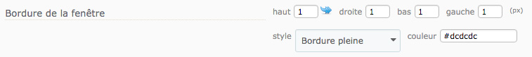
This allows you to modify the border of the modal window. You can set its width in pixels for each side and also set the style and color of the border.
Window Padding
This allows you to manage the space between the content of the window and the block that contains it.
The blue arrow allows you to apply the value from the first cell to all the others
Drop Shadow for the Window
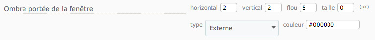
This allows you to set a drop shadow for the modal window. You can set the dimensions, type (inside or outside the window) and its color.
Dim Site Content
This allows you to activate a blur effect for the page in order to draw attention to the modal window that has just appeared.
Color
This allows you to set the blur color applied to the page when a modal window is opened.
You can also create a two-color gradient by ticking the gradient checkbox, then entering the second color.
Opacity
This allows you to set the opacity of the blur applied to the page when a modal window is opened.
Show Close Window Button
This allows you to provide a button for your customers to be able to close the modal window. If this option is deactivated, your customers will have to either click outside the window or use the Continue Shopping button (if activated) to close the window.
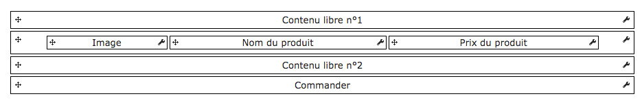
Last Product Added
This type of window allows you to show a description sheet for the product added. You can choose to display its image, its description or its price.
Configuration
Show Title
This allows you to show a title for the modal windows.
This title can be configured in the graphical representation.
Show Free Content 1
This allows you to show a free content zone.
You can set a background color and the borders for this zone and there is a text area that you can use to enter variables, such as the number of products or the cart total.
Show Free Content 2
This allows you to show a free content zone.
You can set a background color and the borders for this zone and there is a text area that you can use to enter variables, such as the number of products or the cart total.
Show the Required Total to be Eligible for Free Shipping
This allows you to show how much more the customer needs to spend before they are eligible for free shipping.
Configure Cross Selling On Cart
This allows you to show cross-selling suggestions in the cart summary window.
You must have purchased our Cross Selling on Cart module and it must be installed and activated
Add to Cart Button Selector (general)
This allows you to set the CSS selector that allows the add to cart button to be highlighted on pages other than a product sheet, such as category pages, for example.
Add to Cart Button Selector (product sheet)
This allows you to set the CSS selector that allows the add to cart button to be recognized on a product sheet.
CSS z-index value for the modal window
This allows you to set the z-index value for the modal window.
The z-index is a value that gives the order for an item. The higher the value, the closer the item will be to the top
Graphical Representation
This diagram represents the structure of the modal window.
This is where you can configure each active item, along with their position, by clicking and dragging the item to the required position, with the mouse on the arrow when you click and drag.
Window Title
Background Color
This allows you to set a background color for the block being edited, by entering hex color code or clicking the box to display the color picker. You can also create a gradient by ticking the gradient checkbox, then entering the second color.
Margin
This allows you to set the horizontal and vertical margins for the container for the block being edited.
The blue arrow allows you to apply the value from the first cell to all the others
Border
This allows you to create a border for the block that contains the item being edited. This is defined in pixels.
The blue arrow allows you to apply the value from the first cell to all the others
Padding
This allows you to set the spacing between the content and the container for the block being edited.
The blue arrow allows you to apply the value from the first cell to all the others
Corner Radius
This allows you to set the corner radius for the block that contains the item being edited. The higher the value, the rounder the corners, And conversely, the lower the value, the sharper the corners.
Drop Shadow
This allows you to set the drop shadow for the block that contains the item being edited. You can set it vertically or horizontally, inside or outside the header container and set its color, blur and offset.
Horizontal Alignment
This allows you to set the horizontal alignment for the container for the item being edited.
Content Options
This block contains the options that allow you to configure the content for the item being edited. You are given variables that allow you to retrieve the context-based information from your customer’s cart.
You can include these variables directly in your text.
Text
This allows you to define the title for the item being edited
You can set one text for each language that has been installed on the shop.
Font Color
This allows you to set the text color of the item being edited.
Font Size
This allows you to set the size of the text in the block being edited.
Style
These options allow you to apply a text style to your title, i.e. bold, italic or underline.
Text Drop Shadow
This allows you to apply a shadow to the text in the block being edited.
Free Content 1
Background Color
This allows you to set a background color for the block being edited, by entering hex color code or clicking the box to display the color picker. You can also create a gradient by ticking the gradient checkbox, then entering the second color.
Margin
This allows you to set the horizontal and vertical margins for the container for the block being edited.
The blue arrow allows you to apply the value from the first cell to all the others
Padding
This allows you to set the spacing between the content and the container for the block being edited.
The blue arrow allows you to apply the value from the first cell to all the others
Border
This allows you to create a border for the block that contains the item being edited. This is defined in pixels.
The blue arrow allows you to apply the value from the first cell to all the others
Corner Radius
This allows you to set the corner radius for the block that contains the item being edited. The higher the value, the rounder the corners, And conversely, the lower the value, the sharper the corners.
Drop Shadow
This allows you to set the drop shadow for the block that contains the item being edited. You can set it vertically or horizontally, inside or outside the header container and set its color, blur and offset.
Content Options
This block contains the options that allow you to configure the content for the item being edited. You are given variables that allow you to retrieve the context-based information from your customer’s cart.
You can include these variables directly in your text.
Content to be Displayed
This allows you to enter the text to be displayed for the item being edited.
You can include content variables.
Free Content 2
Background Color
This allows you to set a background color for the block being edited, by entering hex color code or clicking the box to display the color picker. You can also create a gradient by ticking the gradient checkbox, then entering the second color.
Margin
This allows you to set the horizontal and vertical margins for the container for the block being edited.
The blue arrow allows you to apply the value from the first cell to all the others
Padding
This allows you to set the spacing between the content and the container for the block being edited.
The blue arrow allows you to apply the value from the first cell to all the others
Border
This allows you to create a border for the block that contains the item being edited. This is defined in pixels.
The blue arrow allows you to apply the value from the first cell to all the others
Corner Radius
This allows you to set the corner radius for the block that contains the item being edited. The higher the value, the rounder the corners, And conversely, the lower the value, the sharper the corners.
Drop Shadow
This allows you to set the drop shadow for the block that contains the item being edited. You can set it vertically or horizontally, inside or outside the header container and set its color, blur and offset.
Content Options
This block contains the options that allow you to configure the content for the item being edited. You are given variables that allow you to retrieve the context-based information from your customer’s cart.
You can include these variables directly in your text.
Content to be Displayed
This allows you to enter the text to be displayed for the item being edited.
You can include content variables.
Image
Show
This allows you to show or hide the block being edited.
The block will appear in red on the graphical representation if hidden
Background Color
This allows you to set a background color for the block being edited, by entering hex color code or clicking the box to display the color picker. You can also create a gradient by ticking the gradient checkbox, then entering the second color.
Width
This allows you to set a width, in pixels, for the block being edited.
Padding
This allows you to set the spacing between the content and the container for the block being edited.
The blue arrow allows you to apply the value from the first cell to all the others
Border
This allows you to create a border for the block that contains the item being edited. This is defined in pixels.
The blue arrow allows you to apply the value from the first cell to all the others
Horizontal Alignment
This allows you to set the horizontal alignment for the container for the item being edited.
Vertical Alignment
This allows you to set the vertical alignment for the container for the item being edited.
Image Size
This allows you to set the size of the product images.
Add Product Sheet Link
This allows you to automatically add a hyperlink to the product image on the product sheet.
Border
This allows you to create a border for the block that contains the item being edited. This is defined in pixels.
The blue arrow allows you to apply the value from the first cell to all the others
Corner Radius
This allows you to set the corner radius for the block that contains the item being edited. The higher the value, the rounder the corners, And conversely, the lower the value, the sharper the corners.
Drop Shadow
This allows you to set the drop shadow for the block that contains the item being edited. You can set it vertically or horizontally, inside or outside the header container and set its color, blur and offset.
Product Name
Show
This allows you to show or hide the block being edited.
The block will appear in red on the graphical representation if hidden
Background Color
This allows you to set a background color for the block being edited, by entering hex color code or clicking the box to display the color picker. You can also create a gradient by ticking the gradient checkbox, then entering the second color.
Width
This allows you to set a width, in pixels, for the block being edited.
Padding
This allows you to set the spacing between the content and the container for the block being edited.
The blue arrow allows you to apply the value from the first cell to all the others
Border
This allows you to create a border for the block that contains the item being edited. This is defined in pixels.
The blue arrow allows you to apply the value from the first cell to all the others
Horizontal Alignment
This allows you to set the horizontal alignment for the container for the item being edited.
Vertical Alignment
This allows you to set the vertical alignment for the container for the item being edited.
Add Product Sheet Link
This allows you to automatically add a hyperlink to the product image on the product sheet.
Font Color
This allows you to set the text color of the item being edited.
Font Size
This allows you to set the size of the text in the block being edited.
Style
These options allow you to apply a text style to your title, i.e. bold, italic or underline.
Text Drop Shadow
This allows you to apply a shadow to the text in the block being edited.
Display Product Attributes
This allows you to show the corresponding attributes as Attributes for each product in the cart, as “Attribute : value”.
Font Color
This allows you to set the text color of the item being edited.
Font Size
This allows you to set the size of the text in the block being edited.
Style
These options allow you to apply a text style to your title, i.e. bold, italic or underline.
Product Price
Show
This allows you to show or hide the block being edited.
The block will appear in red on the graphical representation if hidden
Background Color
This allows you to set a background color for the block being edited, by entering hex color code or clicking the box to display the color picker. You can also create a gradient by ticking the gradient checkbox, then entering the second color.
Width
This allows you to set a width, in pixels, for the block being edited.
Padding
This allows you to set the spacing between the content and the container for the block being edited.
The blue arrow allows you to apply the value from the first cell to all the others
Border
This allows you to create a border for the block that contains the item being edited. This is defined in pixels.
The blue arrow allows you to apply the value from the first cell to all the others
Horizontal Alignment
This allows you to set the horizontal alignment for the container for the item being edited.
Vertical Alignment
This allows you to set the vertical alignment for the container for the item being edited.
Font Color
This allows you to set the text color of the item being edited.
Font Size
This allows you to set the size of the text in the block being edited.
Style
These options allow you to apply a text style to your title, i.e. bold, italic or underline.
Text Drop Shadow
This allows you to apply a shadow to the text in the block being edited.
Product Description
Show
This allows you to show or hide the block being edited.
The block will appear in red on the graphical representation if hidden
Background Color
This allows you to set a background color for the block being edited, by entering hex color code or clicking the box to display the color picker. You can also create a gradient by ticking the gradient checkbox, then entering the second color.
Width
This allows you to set a width, in pixels, for the block being edited.
Padding
This allows you to set the spacing between the content and the container for the block being edited.
The blue arrow allows you to apply the value from the first cell to all the others
Border
This allows you to create a border for the block that contains the item being edited. This is defined in pixels.
The blue arrow allows you to apply the value from the first cell to all the others
Horizontal Alignment
This allows you to set the horizontal alignment for the container for the item being edited.
Vertical Alignment
This allows you to set the vertical alignment for the container for the item being edited.
Truncate Text
This allows you to activate automatic truncation of the product descriptions. The maximum length is set in the option below.
Limit Text To
This allows you to set the maximum number of characters of the product description to appear before it is truncated.
Font Color
This allows you to set the text color of the item being edited.
Font Size
This allows you to set the size of the text in the block being edited.
Style
These options allow you to apply a text style to your title, i.e. bold, italic or underline.
Text Drop Shadow
This allows you to apply a shadow to the text in the block being edited.
Information regarding the total required for free shipping to apply
Background Color
This allows you to set a background color for the block being edited, by entering hex color code or clicking the box to display the color picker. You can also create a gradient by ticking the gradient checkbox, then entering the second color.
Margin
This allows you to set the horizontal and vertical margins for the container for the block being edited.
The blue arrow allows you to apply the value from the first cell to all the others
Padding
This allows you to set the spacing between the content and the container for the block being edited.
The blue arrow allows you to apply the value from the first cell to all the others
Border
This allows you to create a border for the block that contains the item being edited. This is defined in pixels.
The blue arrow allows you to apply the value from the first cell to all the others
Corner Radius
This allows you to set the corner radius for the block that contains the item being edited. The higher the value, the rounder the corners, And conversely, the lower the value, the sharper the corners.
Drop Shadow
This allows you to set the drop shadow for the block that contains the item being edited. You can set it vertically or horizontally, inside or outside the header container and set its color, blur and offset.
Content Options
This block contains the options that allow you to configure the content for the item being edited. You are given variables that allow you to retrieve the context-based information from your customer’s cart.
You can include these variables directly in your text.
Content to be Displayed
This allows you to enter the text to be displayed for the item being edited.
You can include content variables.
Continue Shopping
Show
This allows you to show or hide the block being edited.
The block will appear in red on the graphical representation if hidden
Background Color
This allows you to set a background color for the block being edited, by entering hex color code or clicking the box to display the color picker. You can also create a gradient by ticking the gradient checkbox, then entering the second color.
Line Height
This allows you to set the height of a line of text content on the button.
Padding
This allows you to set the spacing between the content and the container for the block being edited.
The blue arrow allows you to apply the value from the first cell to all the others
Border
This allows you to create a border for the block that contains the item being edited. This is defined in pixels.
The blue arrow allows you to apply the value from the first cell to all the others
Horizontal Alignment
This allows you to set the horizontal alignment for the container for the item being edited.
Text
This allows you to define the title for the item being edited
You can set one text for each language that has been installed on the shop.
Font Color
This allows you to set the text color of the item being edited.
Font Size
This allows you to set the size of the text in the block being edited.
Style
These options allow you to apply a text style to your title, i.e. bold, italic or underline.
Text Drop Shadow
This allows you to apply a shadow to the text in the block being edited.
Prefer minimal mode (or else use realistic mode)
This allows you to set the style of the buttons. Minimal mode creates a top-down gradient with the color defined below.
Realistic mode creates a gradient using several shades in order to provide a more striking effect.
Text Color
This allows you to set the text color for the buttons in the item being edited.
Button Background Color
This allows you to set the background color of the buttons in the item being edited
MouseOver Button Text Color
This allows you to set the mouseOver text color for the buttons in the item being edited.
MouseOver Button Background Color
This allows you to set the mouseOver background color of the buttons in the item being edited
Padding
This allows you to set the spacing between the content and the container for the block being edited.
The blue arrow allows you to apply the value from the first cell to all the others
Corner Radius
This allows you to set the corner radius for the block that contains the item being edited. The higher the value, the rounder the corners, And conversely, the lower the value, the sharper the corners.
Order
Show
This allows you to show or hide the block being edited.
The block will appear in red on the graphical representation if hidden
Background Color
This allows you to set a background color for the block being edited, by entering hex color code or clicking the box to display the color picker. You can also create a gradient by ticking the gradient checkbox, then entering the second color.
Line Height
This allows you to set the height of a line of text content on the button.
Padding
This allows you to set the spacing between the content and the container for the block being edited.
The blue arrow allows you to apply the value from the first cell to all the others
Border
This allows you to create a border for the block that contains the item being edited. This is defined in pixels.
The blue arrow allows you to apply the value from the first cell to all the others
Horizontal Alignment
This allows you to set the horizontal alignment for the container for the item being edited.
Text
This allows you to define the title for the item being edited
You can set one text for each language that has been installed on the shop.
Font Color
This allows you to set the text color of the item being edited.
Font Size
This allows you to set the size of the text in the block being edited.
Style
These options allow you to apply a text style to your title, i.e. bold, italic or underline.
Text Drop Shadow
This allows you to apply a shadow to the text in the block being edited.
Prefer minimal mode (or else use realistic mode)
This allows you to set the style of the buttons. Minimal mode creates a top-down gradient with the color defined below.
Realistic mode creates a gradient using several shades in order to provide a more striking effect.
Text Color
This allows you to set the text color for the buttons in the item being edited.
Button Background Color
This allows you to set the background color of the buttons in the item being edited
MouseOver Button Text Color
This allows you to set the mouseOver text color for the buttons in the item being edited.
MouseOver Button Background Color
This allows you to set the mouseOver background color of the buttons in the item being edited
Padding
This allows you to set the spacing between the content and the container for the block being edited.
The blue arrow allows you to apply the value from the first cell to all the others
Corner Radius
This allows you to set the corner radius for the block that contains the item being edited. The higher the value, the rounder the corners, And conversely, the lower the value, the sharper the corners.
Appearance
Window Width (px)
This allows you to set the size of the modal window, in pixels.
Window Background Color
This allows you to set the background color for the modal window. You can also create a two-color gradient by ticking the gradient checkbox, then choosing the second color in the new field that appears.
Window Corner Radius
This allows you to set the corner radius for the modal window. The higher the value, the rounder the corner. And conversely, the lower the value, the sharper the corners.
Window Border
This allows you to modify the border of the modal window. You can set its width in pixels for each side and also set the style and color of the border.
Window Padding
This allows you to manage the space between the content of the window and the block that contains it.
The blue arrow allows you to apply the value from the first cell to all the others
Drop Shadow for the Window
This allows you to set a drop shadow for the modal window. You can set the dimensions, type (inside or outside the window) and its color.
Dim Site Content
This allows you to activate a blur effect for the page in order to draw attention to the modal window that has just appeared.
Color
This allows you to set the blur color applied to the page when a modal window is opened.
You can also create a two-color gradient by ticking the gradient checkbox, then entering the second color.
Opacity
This allows you to set the opacity of the blur applied to the page when a modal window is opened.
Show Close Window Button
This allows you to provide a button for your customers to be able to close the modal window. If this option is deactivated, your customers will have to either click outside the window or use the Continue Shopping button (if activated) to close the window.
Notification
This type of window allows you to show a notification in order to inform your customer that the product has been added to its cart.
Notification Center Position
This allows you to set the position of the notification center. This is the position where the product added to cart notifications will be displayed.
You can display them in any corner of the screen.
Persistent Mode
This allows you to make your notifications persistent. When this option is active, a notification will remain visible until your customer closes it manually. If this option is inactive, the notifications will close automatically once the timeout defined in the following option is reached.
Close Time (ms)
This allows you to set the display timeout for a notification before it is automatically closed, when Persistant Mode is deactivated.
Show Order Button
This allows you to show an Order button in each notification that takes your customer to their cart.
Show Free Content 1
This allows you to show a free content zone.
You can set a background color and the borders for this zone and there is a text area that you can use to enter variables, such as the number of products or the cart total.
Show Free Content 2
This allows you to show a free content zone.
You can set a background color and the borders for this zone and there is a text area that you can use to enter variables, such as the number of products or the cart total.
Add to Cart Button Selector (general)
This allows you to set the CSS selector that allows the add to cart button to be highlighted on pages other than a product sheet, such as category pages, for example.
Add to Cart Button Selector (product sheet)
This allows you to set the CSS selector that allows the add to cart button to be recognized on a product sheet.
Graphical Representation
This diagram represents the structure of the modal window. This is where you can configure each active item, along with their position, by clicking and dragging the item to the required position, with the mouse on the arrow when you click and drag.
Free Content 1
Background Color
This allows you to set a background color for the block being edited, by entering hex color code or clicking the box to display the color picker. You can also create a gradient by ticking the gradient checkbox, then entering the second color.
Padding
This allows you to set the spacing between the content and the container for the block being edited.
The blue arrow allows you to apply the value from the first cell to all the others
Border
This allows you to create a border for the block that contains the item being edited. This is defined in pixels.
The blue arrow allows you to apply the value from the first cell to all the others
Corner Radius
This allows you to set the corner radius for the block that contains the item being edited. The higher the value, the rounder the corners, And conversely, the lower the value, the sharper the corners.
Content Options
This block contains the options that allow you to configure the content for the item being edited. You are given variables that allow you to retrieve the context-based information from your customer’s cart.
You can include these variables directly in your text.
Content to be Displayed
This allows you to enter the text to be displayed for the item being edited.
You can include content variables.
Image
Show
This allows you to show or hide the block being edited.
The block will appear in red on the graphical representation if hidden
Background Color
This allows you to set a background color for the block being edited, by entering hex color code or clicking the box to display the color picker. You can also create a gradient by ticking the gradient checkbox, then entering the second color.
Width
This allows you to set a width, in pixels, for the block being edited.
Padding
This allows you to set the spacing between the content and the container for the block being edited.
The blue arrow allows you to apply the value from the first cell to all the others
Border
This allows you to create a border for the block that contains the item being edited. This is defined in pixels.
The blue arrow allows you to apply the value from the first cell to all the others
Horizontal Alignment
This allows you to set the horizontal alignment for the container for the item being edited.
Vertical Alignment
This allows you to set the vertical alignment for the container for the item being edited.
Image Size
This allows you to set the size of the product images.
Add Product Sheet Link
This allows you to automatically add a hyperlink to the product image on the product sheet.
Border
This allows you to create a border for the block that contains the item being edited. This is defined in pixels.
The blue arrow allows you to apply the value from the first cell to all the others
Corner Radius
This allows you to set the corner radius for the block that contains the item being edited. The higher the value, the rounder the corners, And conversely, the lower the value, the sharper the corners.
Drop Shadow
This allows you to set the drop shadow for the block that contains the item being edited. You can set it vertically or horizontally, inside or outside the header container and set its color, blur and offset.
Product Name
Background Color
This allows you to set a background color for the block being edited, by entering hex color code or clicking the box to display the color picker. You can also create a gradient by ticking the gradient checkbox, then entering the second color.
Width
This allows you to set a width, in pixels, for the block being edited.
Padding
This allows you to set the spacing between the content and the container for the block being edited.
The blue arrow allows you to apply the value from the first cell to all the others
Border
This allows you to create a border for the block that contains the item being edited. This is defined in pixels.
The blue arrow allows you to apply the value from the first cell to all the others
Horizontal Alignment
This allows you to set the horizontal alignment for the container for the item being edited.
Vertical Alignment
This allows you to set the vertical alignment for the container for the item being edited.
Add Product Sheet Link
This allows you to automatically add a hyperlink to the product image on the product sheet.
Font Color
This allows you to set the text color of the item being edited.
Font Size
This allows you to set the size of the text in the block being edited.
Style
These options allow you to apply a text style to your title, i.e. bold, italic or underline.
Text Drop Shadow
This allows you to apply a shadow to the text in the block being edited.
Display Product Attributes
This allows you to show the corresponding attributes as Attributes for each product in the cart, as “Attribute : value”.
Font Color
This allows you to set the text color of the item being edited.
Font Size
This allows you to set the size of the text in the block being edited.
Style
These options allow you to apply a text style to your title, i.e. bold, italic or underline.
Product Price
Show
This allows you to show or hide the block being edited.
The block will appear in red on the graphical representation if hidden
Background Color
This allows you to set a background color for the block being edited, by entering hex color code or clicking the box to display the color picker. You can also create a gradient by ticking the gradient checkbox, then entering the second color.
Width
This allows you to set a width, in pixels, for the block being edited.
Padding
This allows you to set the spacing between the content and the container for the block being edited.
The blue arrow allows you to apply the value from the first cell to all the others
Border
This allows you to create a border for the block that contains the item being edited. This is defined in pixels.
The blue arrow allows you to apply the value from the first cell to all the others
Horizontal Alignment
This allows you to set the horizontal alignment for the container for the item being edited.
Vertical Alignment
This allows you to set the vertical alignment for the container for the item being edited.
Font Color
This allows you to set the text color of the item being edited.
Font Size
This allows you to set the size of the text in the block being edited.
Style
These options allow you to apply a text style to your title, i.e. bold, italic or underline.
Text Drop Shadow
This allows you to apply a shadow to the text in the block being edited.
Free Content 2
Background Color
This allows you to set a background color for the block being edited, by entering hex color code or clicking the box to display the color picker. You can also create a gradient by ticking the gradient checkbox, then entering the second color.
Padding
This allows you to set the spacing between the content and the container for the block being edited.
The blue arrow allows you to apply the value from the first cell to all the others
Border
This allows you to create a border for the block that contains the item being edited. This is defined in pixels.
The blue arrow allows you to apply the value from the first cell to all the others
Corner Radius
This allows you to set the corner radius for the block that contains the item being edited. The higher the value, the rounder the corners, And conversely, the lower the value, the sharper the corners.
Content Options
This block contains the options that allow you to configure the content for the item being edited. You are given variables that allow you to retrieve the context-based information from your customer’s cart.
You can include these variables directly in your text.
Content to be Displayed
This allows you to enter the text to be displayed for the item being edited.
You can include content variables.
Order
Show
This allows you to show or hide the block being edited.
The block will appear in red on the graphical representation if hidden
Background Color
This allows you to set a background color for the block being edited, by entering hex color code or clicking the box to display the color picker. You can also create a gradient by ticking the gradient checkbox, then entering the second color.
Line Height
This allows you to set the height of a line of text content on the button.
Padding
This allows you to set the spacing between the content and the container for the block being edited.
The blue arrow allows you to apply the value from the first cell to all the others
Border
This allows you to create a border for the block that contains the item being edited. This is defined in pixels.
The blue arrow allows you to apply the value from the first cell to all the others
Horizontal Alignment
This allows you to set the horizontal alignment for the container for the item being edited.
Text
This allows you to define the title for the item being edited
You can set one text for each language that has been installed on the shop.
Font Color
This allows you to set the text color of the item being edited.
Font Size
This allows you to set the size of the text in the block being edited.
Style
These options allow you to apply a text style to your title, i.e. bold, italic or underline.
Text Drop Shadow
This allows you to apply a shadow to the text in the block being edited.
Prefer minimal mode (or else use realistic mode)
This allows you to set the style of the buttons. Minimal mode creates a top-down gradient with the color defined below.
Realistic mode creates a gradient using several shades in order to provide a more striking effect.
Text Color
This allows you to set the text color for the buttons in the item being edited.
Button Background Color
This allows you to set the background color of the buttons in the item being edited
MouseOver Button Text Color
This allows you to set the mouseOver text color for the buttons in the item being edited.
MouseOver Button Background Color
This allows you to set the mouseOver background color of the buttons in the item being edited
Padding
This allows you to set the spacing between the content and the container for the block being edited.
The blue arrow allows you to apply the value from the first cell to all the others
Corner Radius
This allows you to set the corner radius for the block that contains the item being edited. The higher the value, the rounder the corners, And conversely, the lower the value, the sharper the corners.
Appearance
Window Width (px)
This allows you to set the size of the modal window, in pixels.
Window Background Color
This allows you to set the background color for the modal window. You can also create a two-color gradient by ticking the gradient checkbox, then choosing the second color in the new field that appears.
Window Corner Radius
This allows you to set the corner radius for the modal window. The higher the value, the rounder the corner. And conversely, the lower the value, the sharper the corners.
Window Border
This allows you to modify the border of the modal window. You can set its width in pixels for each side and also set the style and color of the border.
Window Padding
This allows you to manage the space between the content of the window and the block that contains it.
The blue arrow allows you to apply the value from the first cell to all the others
Window Margin
This allows you to set the outside margins for the notification window.
The blue arrow allows you to apply the value from the first cell to all the others
Drop Shadow for the Window
This allows you to set a drop shadow for the modal window. You can set the dimensions, type (inside or outside the window) and its color.
Font Color
This allows you to set the text color of the item being edited.
Font Size
This allows you to set the size of the text in the block being edited.
Style
These options allow you to apply a text style to your title, i.e. bold, italic or underline.
Cross-Selling
This gives you access to the Cross Selling on Cart configuration in Modal Cart. The Cross Selling on Cart configuration defined here not the same as that in the module itself.
For more information on how to configure it in Modal Cart, see Cross Selling on Cart here.
Link Modal Cart 3 with Cross Selling on Cart
This allows you to link with Cross Selling on Cart so that you can configure it.
You must link both modules in order to be able to use them together
Advanced Styles
Modify CSS styles
This allows you to modify the styles for the module by adding custom CSS rules.